Loyalty program
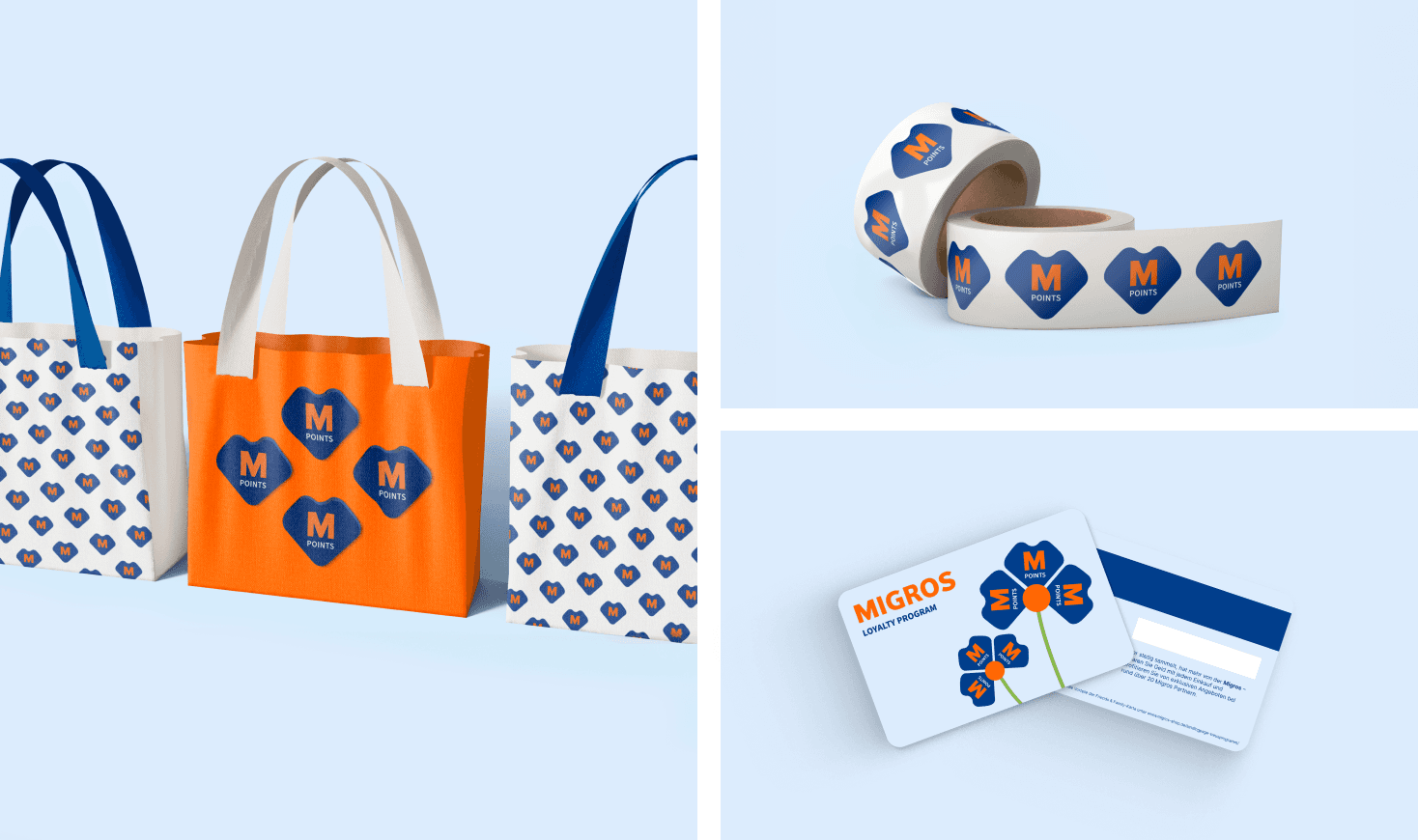
The "M-Point" currency was designed with a flexible and unique shape that evokes a heart, symbolizing the connection and loyalty between the brand and its customers. This currency is versatile, allowing it to be used both separately and grouped together, enabling the creation of various shapes and configurations. The design also includes a space where the price or value can be placed inside each unit, enhancing its practicality. To maintain brand consistency, the Migros color palette was applied to the "M-Point" currency, ensuring that it aligns seamlessly with the overall brand identity.

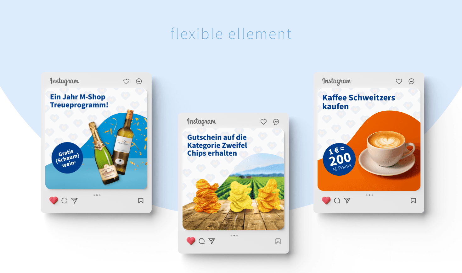
Member-Only Promotions
As part of the M-Shop loyalty program, special promotions were created exclusively for loyalty members. To support these promotions, unique templates were designed with the loyalty program's currency pattern used as a background element. The templates feature dynamic bubbles to highlight promotional messages and prominently display the main products that are on promotion. This design approach ensures that each promotion is visually cohesive and aligned with the overall loyalty program, enhancing the sense of exclusivity and value for members.
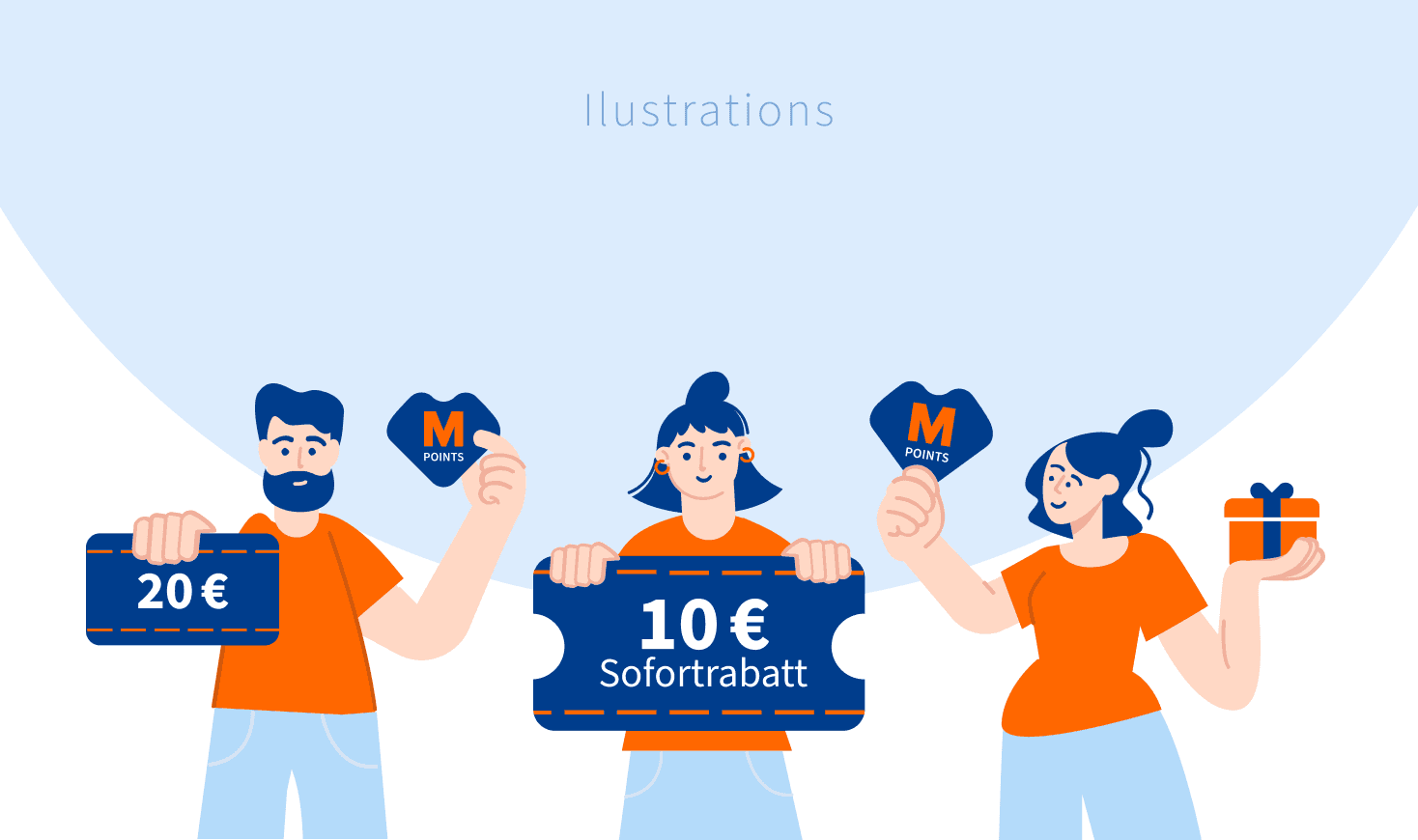
Custom Illustrations
For certain always-on promotions, a different visual approach was utilized by incorporating custom illustrations. While maintaining the same layout as other promotional templates, these versions featured unique illustrations, including characters and additional graphic elements, to bring the promotions to life. This approach added a playful and engaging touch to the promotions, making them stand out while still aligning with the overall design consistency of the loyalty program. These custom illustrations helped to create a more personalized and memorable experience for loyalty members.

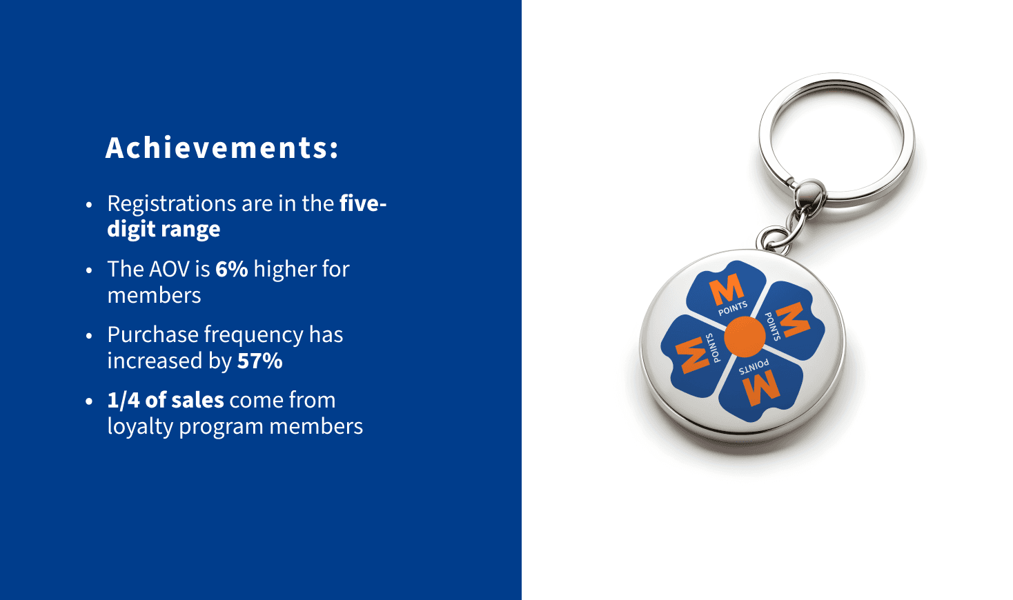
Outcomes
Loyalty program elements were crafted to not only attract attention but also to build a sense of belonging among users, encouraging them to actively participate in the bonus program. The M-Point currency, with its unique and flexible design, served as a symbol of value and reward, while the overall visual identity reinforced the program's exclusivity. By creating engaging and consistent visuals, the project aimed to increase user engagement and drive participation, ultimately contributing to the program's success.