
Research
The initial step in the redesign process was to thoroughly understand the brand, the customers, and their needs. To achieve this, an association map was created to explore the perceptions and key associations people have with the Migros brand. This map helped define the keywords that are top of mind for customers, serving as the foundation for the design direction and ensuring the refresh remained true to what customers value most about Migros.

Personas and Moodboards
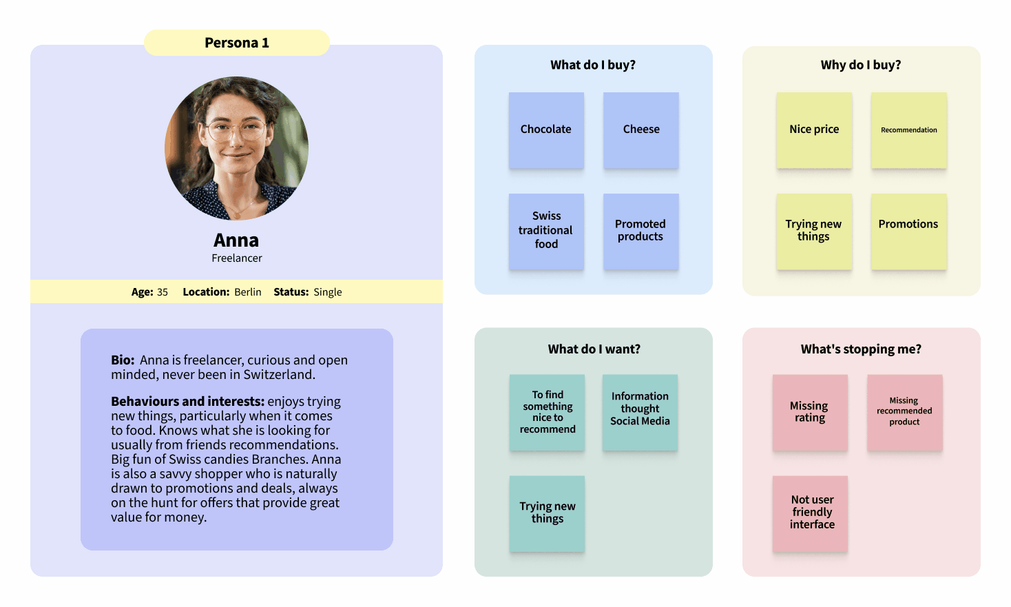
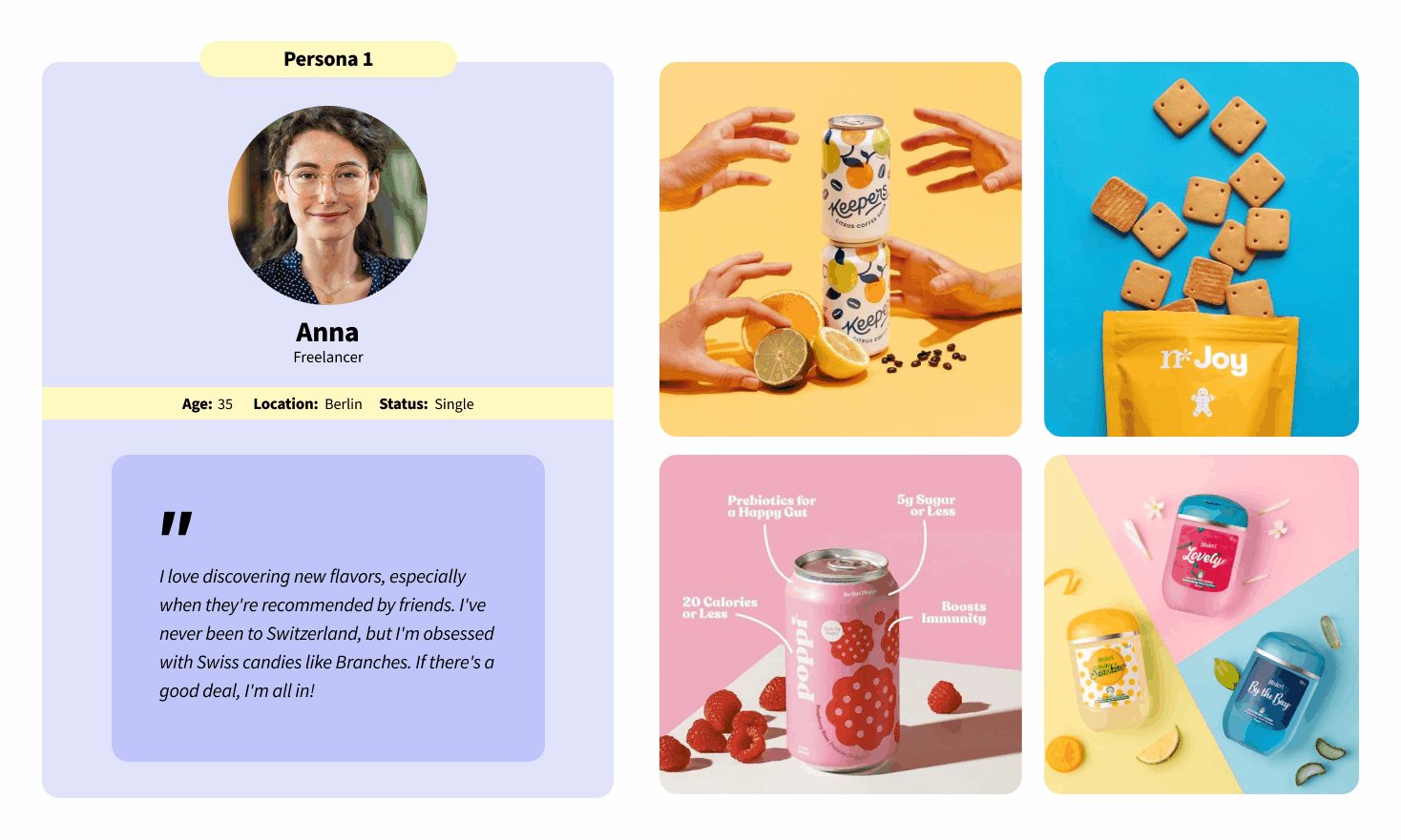
With data provided by the project manager, the next step in the brand refresh process was to create three detailed personas. These personas were carefully crafted to represent key customer segments, reflecting their behaviors, needs, and pain points. After defining the customer behaviors and understanding their needs and challenges, the focus shifted to visualizing these insights. Three moodboards were created, each tailored to the specific persona. These moodboards captured the essence of each customer group, providing a visual direction that would guide the overall design process and ensure that the refreshed brand would resonate deeply with its target audience.
Typography & Colors
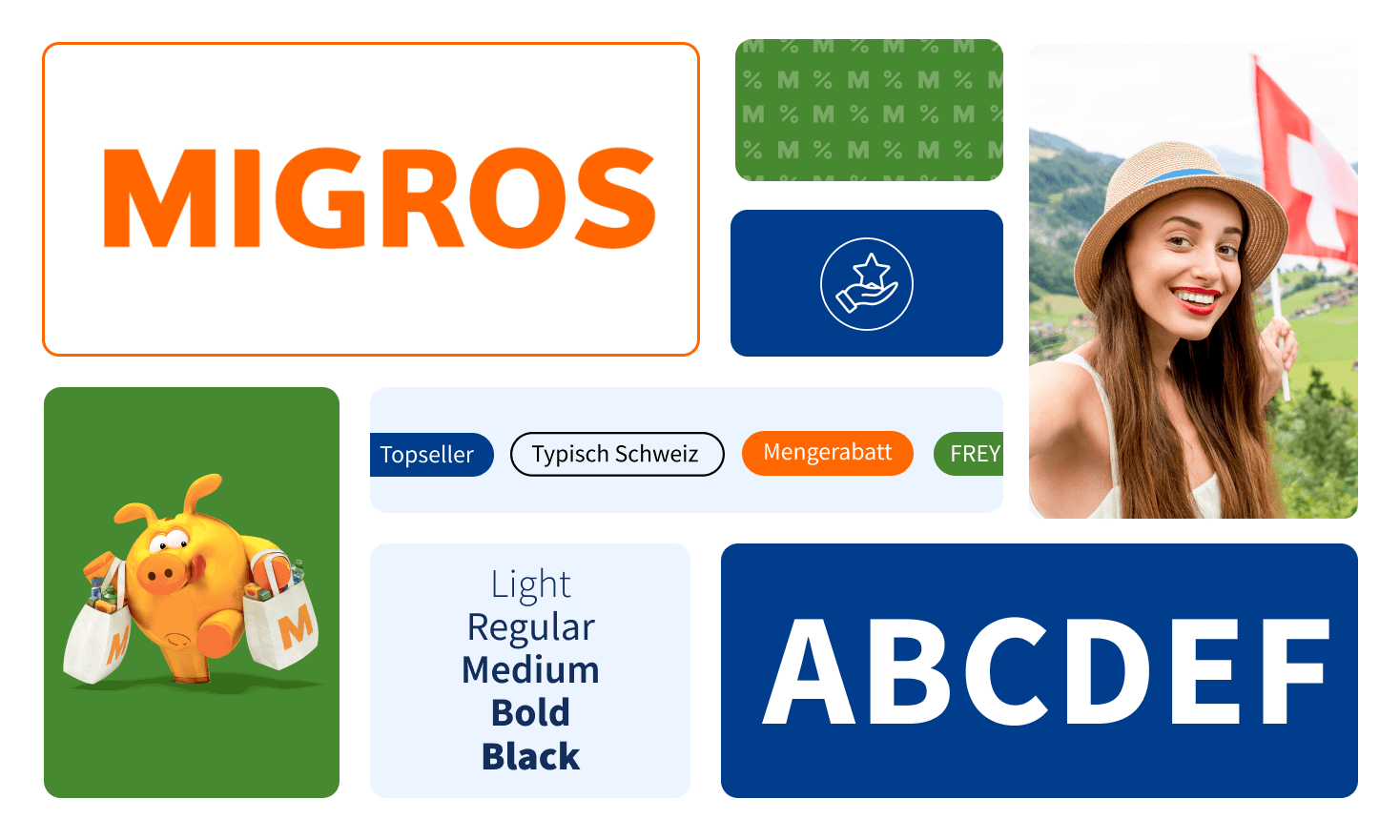
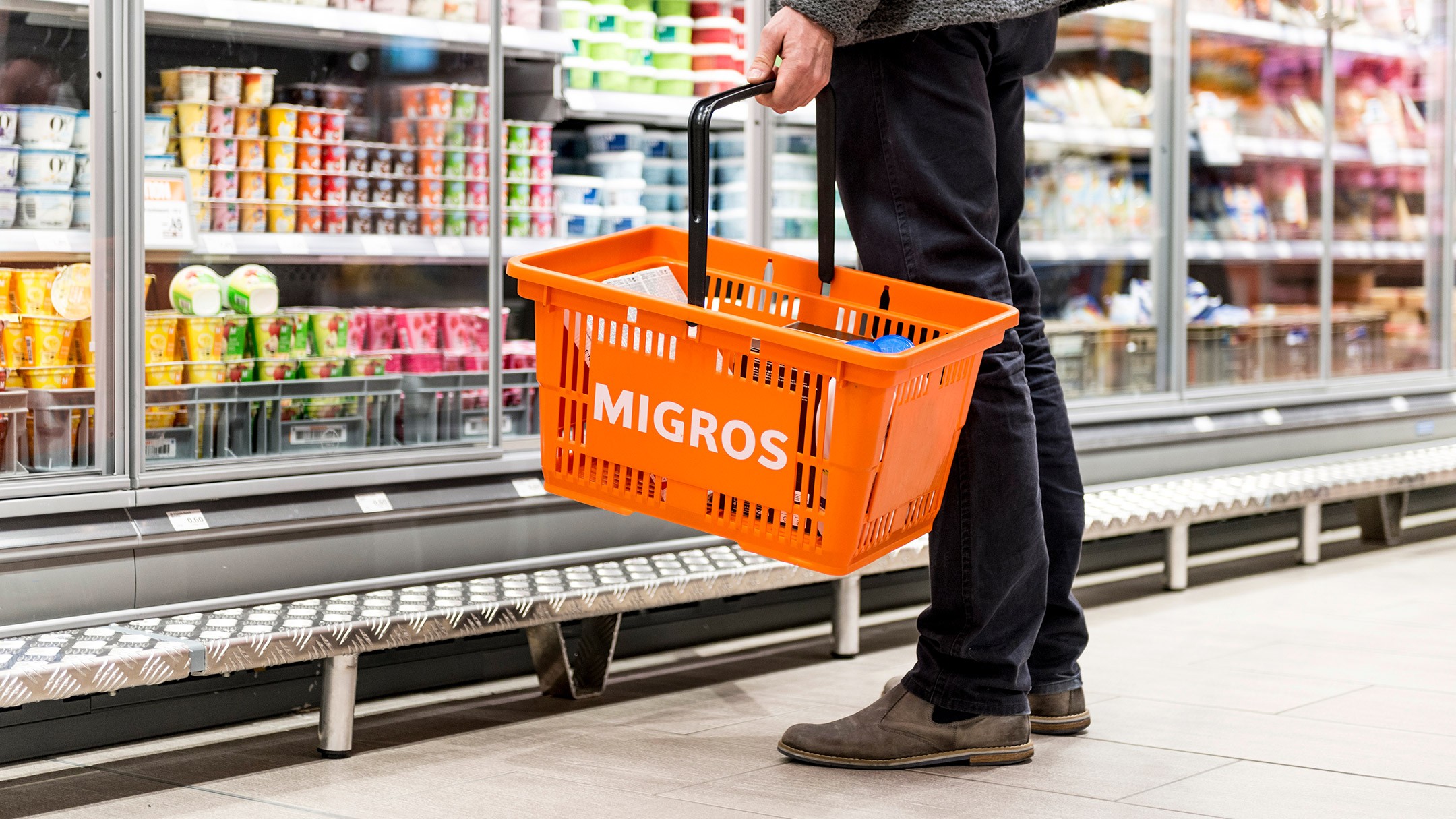
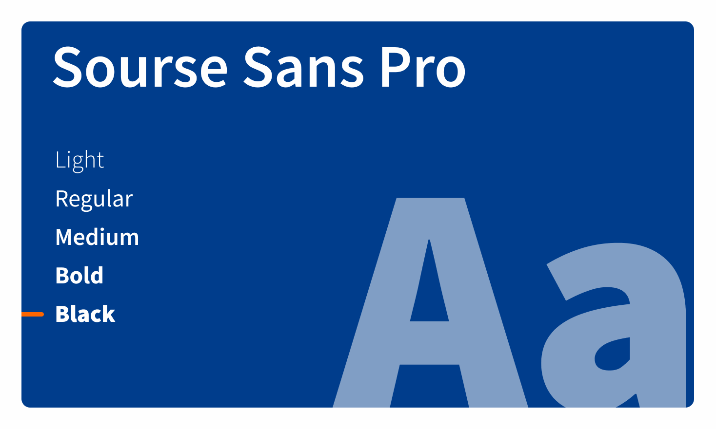
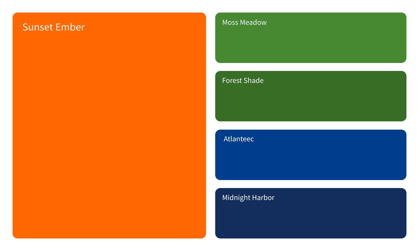
The current font, Source Sans Pro, remains the primary typeface due to its simplicity, clarity, and alignment with the brand’s objectives. Additional font weights have been incorporated to create emphasis and enhance visual hierarchy, allowing for key information to stand out while maintaining a clean, functional design. The iconic Migros orange has kept to maintain strong brand association with Migros Switzerland. However, adjustments have been made to the blue and green tones, aiming to improve readability. The previous colors lacked contrast, which impacted text clarity. To address this, the updated colors are more vibrant, ensuring better readability and a stronger visual impact. Light tones have also been introduced as background options, adding balance and supporting text clarity across various layouts.
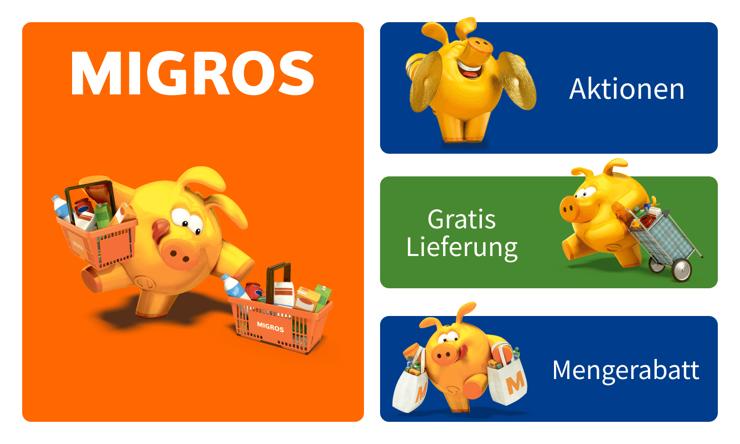
Miggy
An essential element of Migros Switzerland’s identity is the character Miggy—an orange pig with strong brand recognition. Miggy appears in numerous ads, especially on TV, and holds an important place in the hearts of Swiss consumers. In the redesign, it was decided to keep Miggy, maintaining the familiar appeal. However, Miggy is now presented against a simpler, cleaner background, utilizing the updated color palette. This approach allows Miggy to stand out while aligning with the fresh, modernized brand aesthetics.
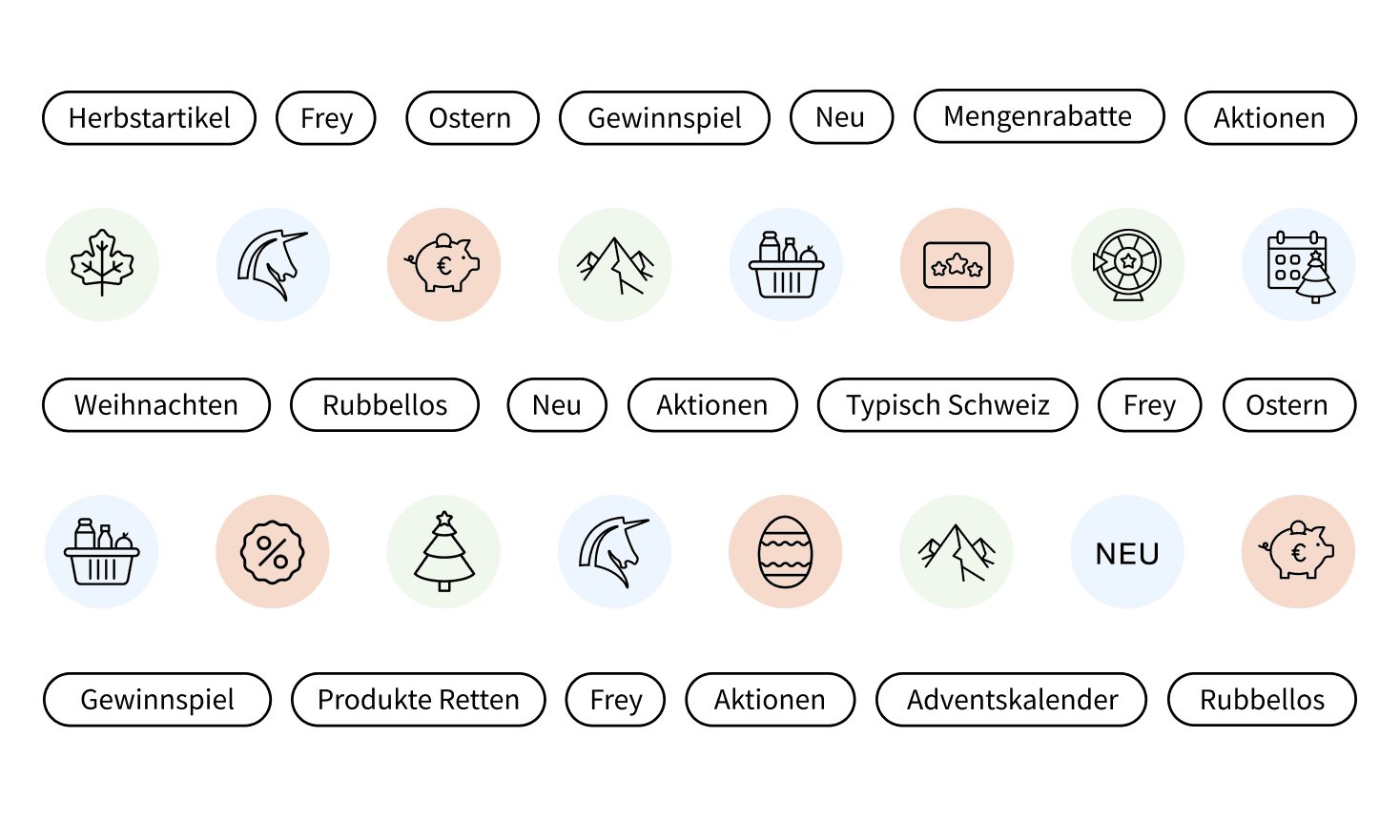
Icons
As part of the refresh, several product improvements were also made. To maintain a consistent and cohesive look, two sets of icons were developed for the website. The first set represents food categories, organized by different types of products. The second set includes filter icons, displayed in the top menu, allowing users to sort products with a simple click. Both icon sets are designed with aligned outlines and a minimalistic style, making them simple and easy to understand. This approach ensures user-friendly experience across the site.

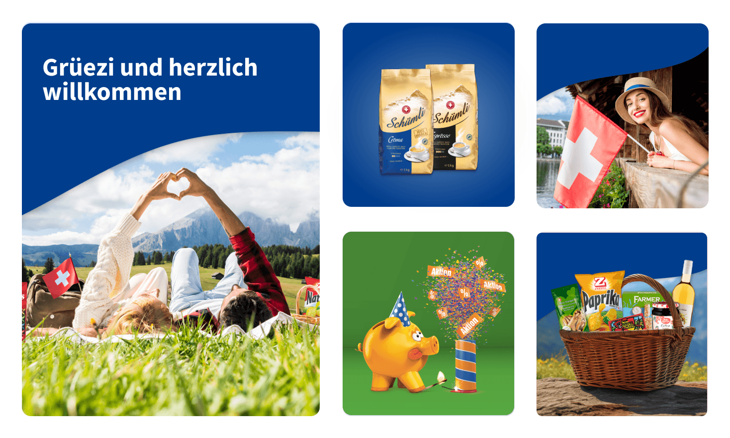
Visuals
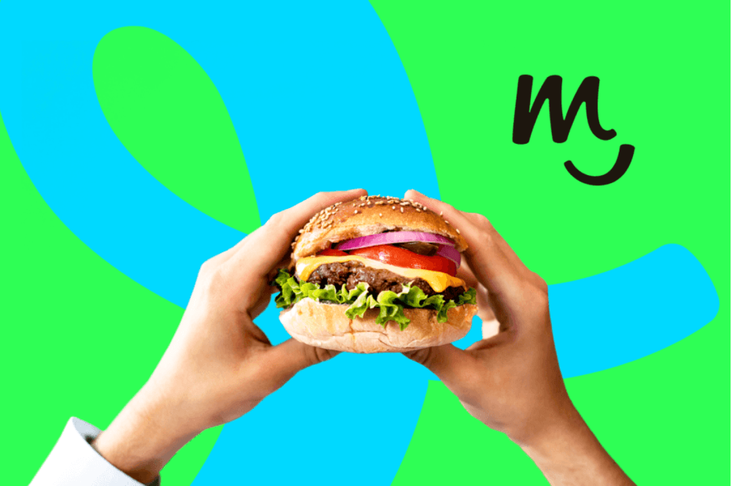
For visuals, a combination of image types was selected to enhance brand storytelling. Mood images are used to convey a particular feeling or vibe, staying true to Migros' brand identity. Product images highlight Migros' offerings with clarity and simplicity, each displayed on a clean background or pattern that aligns with Migros' design language. Mixed images—blending mood and product elements—were created to add depth and context, working especially well for certain products like wine and coffee. Additionally, a shape from the loyalty program was incorporated to create a cohesive link across visuals, reinforcing the brand's unified design approach.
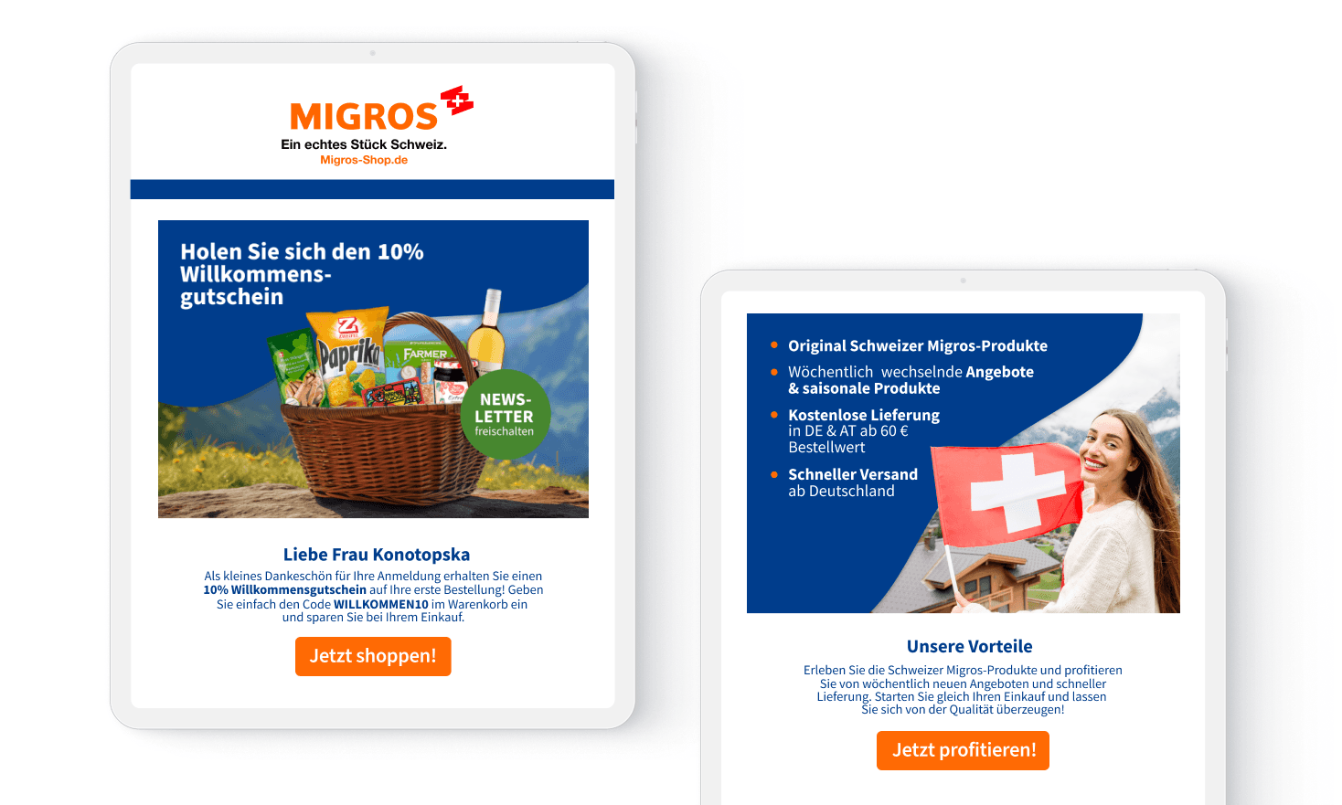
Newsletter Automation
The first project following the redesign was Newsletter Automation. This initiative provided an excellent opportunity to see how the new look and feel performed in practice. As the initial touchpoint with users, it served as an early test for the updated design elements, and the general feedback was positive, indicating a successful start for the refreshed brand identity.
Project Summary
Although the redesign was not fully launched due to the restracture, a substantial amount of groundwork and creative development was achieved throughout the project. This initiative involved comprehensive planning, strategic brainstorming, and a multi-phase creative process. This project represented a significant effort to elevate the brand’s identity, backed by research and creative direction, with positive feedback received on the initial test of the new design in newsletter automation.